How to create a donut chart on tableau
If you’re learning Tableau and confused about when to use a donut chart instead of a pie or bar chart, this guide walks you through the exact use cases, steps, and common mistakes.
Who this is for
- Tableau beginners
- Business analysts
- Interview preparation
In our example we are going to use the sample data –
Superstore available in tableau.
Step 1: Create a calculated field and Name it as ‘Donut’.
Step 2: Drag the Donut calculated field we created into the
Rows shelf twice.
Step 3: Right click on the second
instance of the field ‘Sum(Donut) shelf’
and make it a ‘Dual axis’
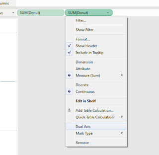
Step 4: Uncheck the ‘Show
header’ option in the same menu once you right click on the ‘Sum(Donut) shelf’
field.

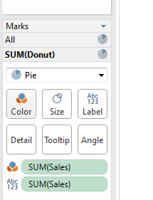
Step 5: Drag the ‘Sales’ measure into the first
instance of Sum(Donut) shelf as below twice. Mark Sum(Sales) as label and color respectively and change the chart type to ‘Pie’
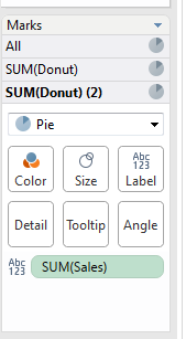
Step 6: Drag the ‘Sales’ Measure again into the Sum(Donut) (2)
shelf as below and make it a label. Here as well change the chart
type to ‘Pie’ as below.
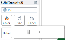
Step 7: Now go back to Sum(Donut) shelf and adjust the size
of the pie as below. Along with the color palette you would like to use.
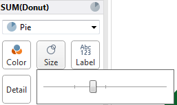
Step 8: Similarly adjust the size of the Sum(Donut) (2) shelf
as well. This would act as the mid-portion of the donut hence color it white
with the overall number displayed at the mid of the Donut.
Step 10: Drag the ‘Category’ field into the ‘Sum(Donut)
shelf’ shelf and see the magic.(You can choose any field based on the type view
you would like to see). Change the ‘Category’ field to color so that you can
see the category names on the Donut chart. Drag another instance of ‘Category’
to ‘Sum(Donut) shelf’ and make it color as below.
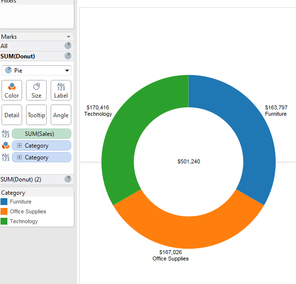
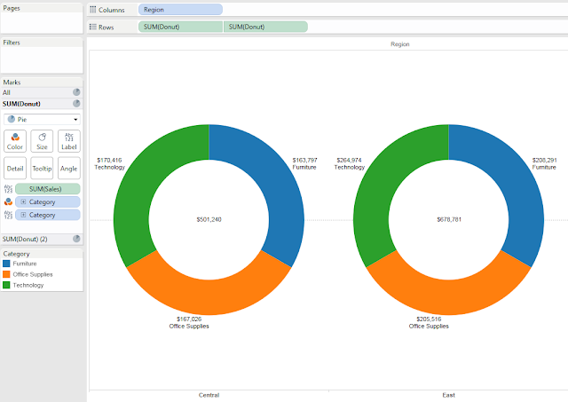
Step 11: Now this is an overall donut chart for sales
category by sales. If you would like to see a further split. Drag and drop the
field by which you want to split the donut into multiple donuts. In this example
we have put the ‘Region’ column into Column shelf and the results look as
below.
Hopefully you have enjoyed creating Donut chart in tableau
and implemented within you reporting environment.
🚀 Want to Master Tableau? Here is what I recommend
Creating charts is just the beginning. If you are serious about Data Analytics career in 2025, having the right resources is critical. Here are the tools I personally find useful:
- For Beginners: Learning Tableau 2024 (Book) - This is the "Bible" for getting started correctly without getting confused by complex features.
- For Visual Design: Storytelling with Data (Cole Nussbaumer Knaflic) - This book changed how I present data. It teaches you why a donut chart might be better (or worse) than a bar chart.
Note: These are affiliate links. If you find them useful and buy through them, I earn a small commission that keeps this blog running at no extra cost to you.


